Here are the recipe cards I made for the last few months.
First up is October's Challenge. The theme was PIE. So I started with Pot Pie and then added a quick card for Pumpkin Pie.
All parts are from Let Me Scrapbook.
The Pie icon I found online and used a filter on it.
Then in November the theme was Turkey or Thanksgiving. I found this recipe online for a one pot meal. Sounds so yummy.
All parts are from Let Me Scrapbook.
December's Challenge is Sweet Treats and Gifts in a Jar. I wanted to make a card that piggy-backed the last few months of themes....Pumpkin that I can. Something Sweet and for a Party, a Pie and Thanksgiving worthy too. :)
All parts are from Let Me Scrapbook.
Font is Oz Handicraft, because I needed to add lots of words, title is Zapfchan Md.
So I made more then one recipe card....keep watching. ;)
All parts from Let Me Scrapbook.
Font is
Other fonts are Starry Night and Poornut.
All parts from Let Me Scrapbook
Font is Marker Fine Point, and Title is LDJ Zany Doodle.
Merry Christmas from CWM_MerryChristmas_Greastest Gift Blog Train
All parts from Let Me Scrapbook
Font for the title is LDJ Pig Sty
12.19.2011
10.16.2011
Still making recipes
Here are a few recipes from the last two months.
In August the recipe theme was canning. Since I only seem to can single items, I made a card for ZUCCHINI RELISH, it is one of the few recipes I have canned.
all parts are from August 2011 LetMeScrapbook recipe kit
font is Cooldots
Then in September the theme was party. I recently talked with a family member who made this dessert for a birthday...I so wanted to make it too. Here is the recipe for DOUBLE CHOCOLATE MINT DESSERT.
all parts from September 2011 LetMeScrapbook recipe kit
fonts are CK Nitelite, Franciscan, and Mikey Jax (title)
7.27.2011
Blueberry Delight
Ever come across a new recipe and think...I've gotta try this. Well today I did that. So here is the recipe I've gotta try.
Title font is Virgin, text body is CK Curly
Kit is the June 2011 recipe kit from LetMeScrapbook
layout is from a previous idea....um sometime last year. :)
Title font is Virgin, text body is CK Curly
Kit is the June 2011 recipe kit from LetMeScrapbook
layout is from a previous idea....um sometime last year. :)
7.19.2011
FRUIT DIP
This month's challenge is all about FRUIT!
All parts are from LetMeScrapbook_July recipe kit.
Font is TXT Hunkaspunk.
All parts are from LetMeScrapbook_July recipe kit.
Font is TXT Hunkaspunk.
6.28.2011
BEEF recipe
I made one more card for this month...it is BEEF! It came from the Kraft web site.
All parts are from LetMeScrapbook June recipe kit and the font is Jester
6.24.2011
Summer is here = time to GRILL
With summer here, we need to break out the grill and cook up something wonderful. For this month's challenge I made some recipe cards for marinades.
all parts are from the June 2011 recipe kit from LetMeScrapbook
the font is Calibri.
all parts are from the June 2011 recipe kit from LetMeScrapbook
the font is Calibri.
5.16.2011
Blank Cards
Just because I posted them in previous months. :)
Playing Catch-up
I truly have been scrapping...just not so much, and not posting anything here.
Here is what I've been working on.
April's Recipe Challenge by LetMeScrapbook was all about PASTA. Here is a card for super quick Manicotti and one for Tortellini soup.
Font for this card is PC Childish.
Font for this card is Perpetua.
Then this month the Theme is Mexican. So I made a card for Enchilada Sauce...love that I have a recipe for times when I don't have a can. :)
The fonts I used were from a blog that made Handwriting fonts. The title is called Pea I am Baker, and the recipes font is in Pea Our Best Bites. (I had to use cooking fonts). I also like the brick work I did. I would like to learn how to make the edges of a page look more ripped or worn....have learning to do. :)
LetMeScrapbook had posted a mini kit for the iNSD (interNational Scrapbook Day) BlogTrain that was called Fiesta. She also challenged anyone who used her kits to post in her Gallery for a prize. I had just returned from a race for the girls and thought the color scheme fit well. So here are the pages I made. I only posted one in her gallery.
I recolored some of the pieces like the frames and ribbon. I also rotated the background pages to an angle. I like the different look it gave the pages. The safety pins were from another kit, I belive a baby kit, I made them B&W. I searched for the Ironman 'M dot' and then looked for a font that matched, I used Lucida Sans. The journaling is in LDJ Noodge, I like the playful look of it.
4.05.2011
Trying new things
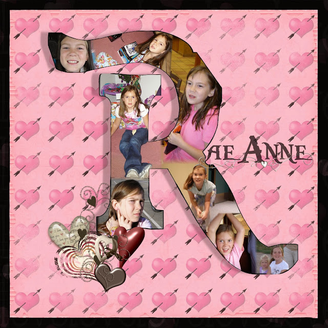
Today I saw a couple of layouts that used a monogram as the main part of the page. It looked interesting and I had to try it before I forgot about it. So I started with some Pirate kits that I have been downloading and decided to use my daughter's R. So the font is Pieces of Eight, kinda a Pirates of the Caribbean feel. I used the largest font size, then outlined it to make it thicker. I then tried another skill of creating a 'window' in a paper. I linked the letter to the page, then selected the letter and deleted it...thus leaving a hole in the page. I then filled the space with pictures of my daughter and this is when she came home...saw the PIRATES paper and asked why it was on there...could I delete it....she really likes peace signs and hearts! So the next little while was spent looking for just the right paper. I typed in HEARTS in my search window, and grabbed what ever popped out at me, for the elements as well. So I have no idea whos paper or elements are on this layout. I still think there needs to be MORE to the monogram...I just don't know if I should highlight the edges of the letter or try to figure out how to do a reversed shadow.....anyway, idea saved.
I messed with it....and look at that shadow. Does it make a difference?
Then since I was in the playing mood, I just randomly clicked open a file and used what was inside and made a layout. The minikit is sahlinstudio_ rejuvenate_addon. I used a flower shape and filled it with the polka-dot paper. Then I just added the elements and some shadows.
Now what to do with it?
3.31.2011
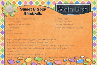
Main Dish Recipe Challenge
This month was a challenge for me to find the time to make a card....I thought about is lots, but I always forgot when I was at the computer. haha
All parts are from LetMeScrapbook_RCC_03_11
Fonts used are Technical, CK Racer and CK Curly
All parts are from LetMeScrapbook_RCC_03_11
Fonts used are Technical, CK Racer and CK Curly
3.03.2011
...last month's challenge...
I didn't forget to last month's challenge, I did get it the card done on time, but I never posted it here. :)
Theme was family recipe. So here is a recipe I grew up on and make for my family.
All part are from Let Me Scrapbook, and the fonts.....I know the main font is Technical...title font? I'll look it up. :)
Theme was family recipe. So here is a recipe I grew up on and make for my family.
All part are from Let Me Scrapbook, and the fonts.....I know the main font is Technical...title font? I'll look it up. :)
1.31.2011
Geocaching Pages
I've had my eye on this kit I came across some time ago....it was all about Geocaching. Today I decided to get it and play with it. There are a few fun things with this kit, and some things I would like to add (if only I knew more). I had some pictures in my folder from an event this past year (thanks Big_E! for them). So off I was in creating today.
Kit is mistyobrien-geocache
Parts I changed are the GPS; color and allowed my own maps to be inserted, and I added the cache box from my mapsource program.
Grid is from a stash I have on hand, unknown credit.
Fonts are Still time, Snap ITC, and PC pigpen
Kit is mistyobrien-geocache
Parts I changed are the GPS; color and allowed my own maps to be inserted, and I added the cache box from my mapsource program.
Grid is from a stash I have on hand, unknown credit.
Fonts are Still time, Snap ITC, and PC pigpen
1.13.2011
Bananas are free right!
I have made another card! It is all because while surfing around I found this 'to-die-for' pointsplus recipe! It is a BANANA!!! and it feels like ICE CREAM. I'm impressed. So I had to share and make a card to spread the good word.
All parts are from the LetMeScrapbook_RCC_01-11
Title font is TXT HunkaSpunk
Other font is technical
recipe is from Danica's Daily
All parts are from the LetMeScrapbook_RCC_01-11
Title font is TXT HunkaSpunk
Other font is technical
recipe is from Danica's Daily
1.09.2011
January Recipe Challenge
This month's theme is Comfort foods. I wasn't sure at first what to do, then the idea of HOT WASSAIL came to mind. I did the regular version and the sugar free version, as well as a blank card. Can I say I LOVE this card. The cute little characters on the bottom are wonderful!!!
All parts are from LetMeScrapbook_January recipe kit
Font is Technical (I love the clean look of this font)
All parts are from LetMeScrapbook_January recipe kit
Font is Technical (I love the clean look of this font)
Subscribe to:
Posts (Atom)