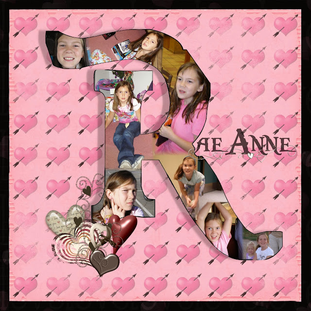
Today I saw a couple of layouts that used a monogram as the main part of the page. It looked interesting and I had to try it before I forgot about it. So I started with some Pirate kits that I have been downloading and decided to use my daughter's R. So the font is Pieces of Eight, kinda a Pirates of the Caribbean feel. I used the largest font size, then outlined it to make it thicker. I then tried another skill of creating a 'window' in a paper. I linked the letter to the page, then selected the letter and deleted it...thus leaving a hole in the page. I then filled the space with pictures of my daughter and this is when she came home...saw the PIRATES paper and asked why it was on there...could I delete it....she really likes peace signs and hearts! So the next little while was spent looking for just the right paper. I typed in HEARTS in my search window, and grabbed what ever popped out at me, for the elements as well. So I have no idea whos paper or elements are on this layout. I still think there needs to be MORE to the monogram...I just don't know if I should highlight the edges of the letter or try to figure out how to do a reversed shadow.....anyway, idea saved.

I messed with it....and look at that shadow. Does it make a difference?
Then since I was in the playing mood, I just randomly clicked open a file and used what was inside and made a layout. The minikit is sahlinstudio_ rejuvenate_addon. I used a flower shape and filled it with the polka-dot paper. Then I just added the elements and some shadows.

Now what to do with it?